iti
iti
a loan hub born to be a role model
a loan hub born to be a role model
a loan hub born to be a role model
15 min read

project overview: revolutionizing iti's loan experience
project overview: revolutionizing iti's loan experience
the challenge: modernizing iti’s loan platform for young, lower-income clients while integrating Itaú’s new design system. The goal was to offer a transparent, user-friendly loan process that matched our users’ hectic lives and evolving financial needs.
my approach: I mapped out customer pain points — such as confusion over banking jargon, unclear loan terms and existing scenarios and its unfoldings — and used these insights to create a seamless, understandable loan journey for different client's moments. The solution provided transparency, financial tips, and personalized experiences, all while aligning with the bank’s business objectives, such as scaling the service and managing risk.
main outcomes
this project aimed to revolutionize Itaú’s loan platform for young, lower-income clients by creating a more user-friendly and transparent experience. Key outcomes included the integration of a new design system, simplified customer journeys, and tools to promote financial health for our clients. The design was iterated based on research, resulting in improved customer trust and higher loan uptake. Achieving a 95% usability score, the project successfully modernized the platform while aligning with business goals like scalability and profitability. It also served ad a role model for the bank's next product hubs, being the first born under constant monitoring for improvement.
who was I in the team?
an external UX designer consultant responsible for the ideation and creation of a new loan's home for iti's* app. This was a high-stakes project, as the loans unit was one of Itaú’s top revenue drivers. I had to balance modernizing the user experience with integrating the new design system and supporting business goals in an ongoing, live product.
* iti is a free digital bank with Itaú's security, and Itaú is the largest financial conglomerate in the Southern Hemisphere
project goal
bringing financial health to the customer by offering the best credit proposal for them to achieve their goals, while achieving profitability and scalability for our business.
sales objectives
boost production (in MM/R$)
increase the number of loans taken, combined with the bank's new credit policy
mitigate the risk of default through customer credit profile analysis
who were we doing it for?
our primary users were young professionals (ages 15–29, about 29 million possible customers in Brazil) from lower-income backgrounds, often informal entrepreneurs. Their financial health was fragile, and they needed a platform that spoke their language and respected their time. By creating a relatable and accessible loan experience, we aimed to help them meet their financial goals while ensuring the bank's profitability.

👆 click to check the available limit scenario's prototype 👆
👆 touch to check the available limit scenario's prototype 👆
strategies behind the new home
strategies behind the new home
I had just joined the team when I was immediately handed a major task: our squad was about to rebuild the loan's home, and I was going to help shape it. With little context about the decision, I couldn’t help but wonder — was this just about creating a beautiful UI, or was there a deeper focus on improving the client's experience? To get to the bottom of it, I asked a ton of questions, determined to understand the bigger picture. What I uncovered was more complex than I expected: a series of critical structural factors had led us to this moment.
1.
technology infrastructure
our current technology was built aiming on just one product (loan)
because the first idea was having just one product, we were using a monolithic code structure (faster to implement at the time it was built, harder to mantain through the evolution and expansion of the loan unit)
this structure did not allow integration with some of our microservices and did not guarantee the agility we needed to change, no longer supporting business planning for various functionalities, subproducts and eventual quick wins
we needed to build a different infrastructure to ensure superior performance and compatibility with current market demands
2.
design system development
Itaú’s design system was so new that our project was one of the first in the bank to develop a product using its guidelines
the new loan’s home would act as a testing ground to integrate and refine this system, setting a strong foundation for consistent future implementations
3.
business learning laboratory
the new loan's home wasn’t just a product — it was designed as a laboratory to explore and test critical aspects of our business:
we were one of the first teams tasked with evaluating how the new design system affected user experience. This meant navigating a mixed interface, where the old and new UI coexisted. It was essential to test this hybrid experience in real-time before rolling it out across the entire app
beyond design, we had to constantly assess how backend improvements influenced user behavior and performance metrics. These changes would directly impact not only the customer experience but also our development efforts and overall ROI
additionally, our team needed to conduct a deep analysis of how the new home affected the sales funnel. We should be able to identify what worked well and where improvements were needed after it went live
all of this was happening in a fast-changing scenario. The loans unit was one of the bank’s two most profitable areas, so we had to ensure that we maintained, or even improved, performance — all while overhauling the entire system structure
4.
iteration and continuous improvement
by comparing ever new data with previously collected metrics, we planned to iterate and continuously refine the loan's home over time
this approach would enable us to make adjustments based on real, actionable insights, ensuring the platform evolved in a way that better met both user needs and our business objectives
clients x loans: highlights from past researches
clients x loans: highlights from past researches

while navigating through the research, I developed a rationale by breaking down the client's journey into key moments, each with specific questions in mind. This approach helped me better understand the Jobs to Be Done (JTBD) when taking out a loan, guiding me toward building a solution that truly aligned with our customers' needs
being new to both the loans universe and the project, I decided to dive into the available past research from our research team. This gave me the depth and context I needed to better understand the challenges ahead. My main findings were:
our customers often feel like they have a distant and cold relationship with their bank(s)
the major issue isn't during the hiring process (although there's much room for improvement)
our customers needed help to better organize themselves financially to avoid getting tangled up
loans have a very negative connotation in Brazilian people's lives no matter for what reason it's taken
customers wanted the bank to celebrate with them when they were up to date
clients often feel like the bank 'punishes' those who pay off the loan (doesn't provide any more credit afterwards)
customers felt like we applied quick and incessant pressure for delays on payments
clients felt that the digital environment brought even more coldness and distance
ok! now, based on our data, how could we offer a WOW experience to our client?
ok! now, based on our data, how could we offer a WOW experience to our client?
1.
more warmth and more knowledge sharing
customers miss the bank sharing more tips about its expertise (finance) so they would be able to make informed decisions alone
2.
security in product choice
we could develop the customer for our product ecosystem without the negative weight of the choice, and help them see themselves on another level
3.
assistance with finances beyond the loan
we could help our customers gain a clearer view of their financial health by sharing original content or partnering with influencers who speak their language. For instance, we could collaborate with influencers like Nath Finanças, a well-known Brazilian figure who helps young people from lower-income households achieve their financial goals
4.
more clarity in information
the Nubank case - in one of the interviews with the research team, a customer shared that after a year of using Nubank's service without a credit card, she applied for one and was approved with a limit of just R$50,00*. Along with the card, she received an explanation of why her credit limit was so low. Surprisingly, she agreed with the analysis, realizing that she wasn’t in a financial position to manage a higher credit limit at that time
* R$ 50,00 = $10,00, approximately

our steps towards launching our rocket ship
our steps towards launching our rocket ship
1. certainties, suppositions, and doubts
to gain an even deeper understanding of the problem (being NASA isn't easy after all), I facilitated two design thinking sessions with the teams. These sessions helped us identify our certainties, challenge our assumptions, and highlight areas where we had doubts. This set the foundation for clearer direction moving forward
2. value proposition
we co-designed our value proposition in collaboration with the teams involved in the development stages. This helped us align on what was feasible in terms of cross-deliveries, as some of our work depended on deliverables from other teams. It ensured that everyone had a shared vision of the value we aimed to create
3. scenarios and use cases
using the insights from the earlier sessions, we mapped out key scenarios and use cases. This helped us focus on the most important user journeys and how our product would address their needs in real-world situations
4. design business critique
as we continued to design our ideal journey-to-be, it became essential to define and refine certain business rules. To facilitate this, I led several sessions between our squad and stakeholders, a process I called "business critique” (yes, a design critique, but to discuss the business directions). Instead of waiting until the end of the design process to show it to our stakeholders (a common practice at the time that resulted in many work re-dos), I decided to try bringing them into the process much earlier to align on strategy and ensure feasibility from the start
evaluating our requisites and as-is to make better decisions
evaluating our requisites and as-is to make better decisions
main scenarios - before

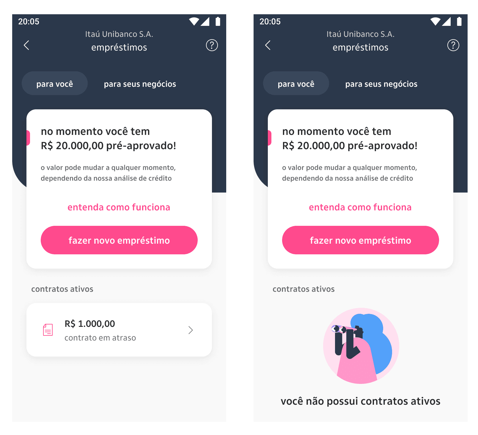
the old loan home had its quirks — like showing an "active contracts" section even when there were no contracts to display, thanks to the rigid structure of the interface. It was a little awkward, to say the least. Another pain point was the lack of guidance for users trying to improve their credit limit. Not everyone was given the option to see what actions they could take, which left many feeling frustrated and powerless in their own financial journey.
the new home, though, was designed with flexibility and personalization at its core. We made sure users would only see relevant options based on their specific situation, and we clearly laid out the steps they could take to increase their available limit. No more dead ends or confusion — just a seamless, tailored experience that put users in control.


loan simulation - before


5 principles that guided our ideas
5 principles that guided our ideas
in the process of developing our product, we knew that a strong foundation was key to ensuring success. To guide our decisions and keep our goals clear, we relied on five core principles. These principles not only shaped our internal discussions but also drove our benchmarking efforts, helping us compare our ideas with industry standards and best practices. By staying true to these guiding concepts, we were able to align our creative process with both user needs and business objectives, paving the way for a product that was as innovative as it was impactful.
1. customer's time is precious
our solution should always simplify or streamline the customer experience, even if it becomes more complex for the bank. #efficiency
2. context in favor of the customers
always use the information the bank has to ease customer's life, anticipating their needs and desires.
#anticipation
3. customers in control
customers need to be able to complete the entire experience through digital channels, having visibility and control over each step of the process.
#autonomy
4. speak customer's language
communication should be clear and objective throughout the experience, inspiring confidence. #transparency #simplicity
#security
5. sequential and holistic
think about everything that can happen to the customer during their journey: what should go right, what can go wrong, and how to solve it in the best way.
#systemic thinking

each of these five principles was rated from -1 to +1 while evaluating other players’ journeys. Then, we evaluated our own product the same way, and summed up all the scores to compare all the players disposed in a single chart. This has helped us understand the best strategies being developed on the market, where we were located in terms of the best experiences, and what else we could do to improve our product.
studying our competition: main conclusions and insights
studying our competition: main conclusions and insights
highlights
most competitors used questionnaires to understand the motivations behind loan requests, helping to better understand the customer's needs
iti did not provide a sense of how many steps the process would take, and although we used a linear journey, not being clear about the next steps reduced customer control over the process, caused fear (of hiring a loan unintentionally after the next step) and required some back and forth readjustments when editing the loan's configuration during the simulation
some competitors used a calendar context for date selection, facilitating deadline identification. We knew this wasn't a possibility at the time due to some restraints in our available dates policy, but we could try to make the date selection easier
Neon and Nubank were the most transparent about the requested amount and the final amount with interest. Itaú's superapp showed the installment amount only, not the total price, impacting the decision-making time
initiating launch protocols
initiating launch protocols
when I began designing the interfaces for the new loan home, I opted not to start with low-fidelity wireframes, as the business team was highly focused on the final look and feel of the screens. Knowing that building high fidelity upfront was going to take a lot of time and open possibilities for having to redo a lot of stuff, I chose to speed up my process by using the components already available from our new design system, assessing whether additional elements would need to be developed within our squad or if they could be delivered in a second version (given our tight timeline, we didn’t have time to reinvent the wheel).


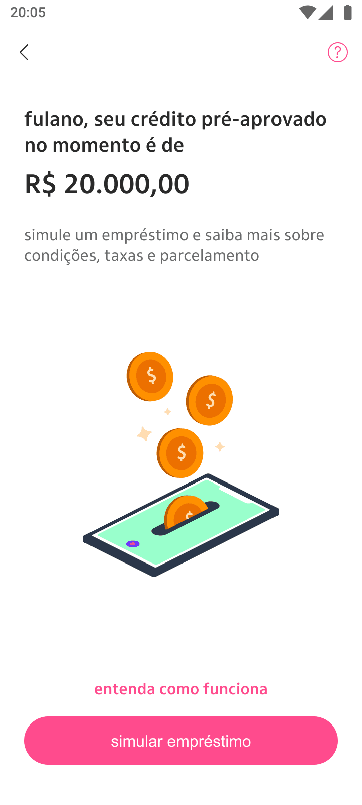
a few details on the available limit screen that were iterated throughout the process
the concept of mapping the client's key moments and presenting a different scenario for each one had proven successful when I presented it to the team, so I championed that approach over delivering a facelifted and slightly improved version of the old way through (that would take much less time to build but would also not solve our issues). Throughout the process, some components were evolving even as I was designing, making it a dynamic, iterative task.
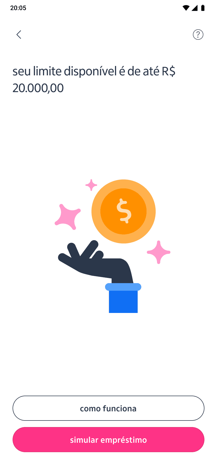
a few versions of the available limit screen that were iterated throughout the process
👆 click to check the available limit scenario's prototype (in case you didn't do that before - or if you want to check it again) 👆
👆 touch to check the available limit scenario's prototype 👆
main home scenarios - after


guerrilla: evaluating the perception of our screens
why did we choose this format?
this was a priority project (one of the bank's highest-yielding units and product)
there was a budget gap to use our external research lab (requirement for conducting all our usability tests) for the following two months, and we needed to test at least something before developing
the recruitment, selection, and customer interviews were conducted by me in collaboration with the research team - so no extra cost needed

highlights
1. customers were able to easily perceive the differences between messages for on-time payments, overdue payments, available limit and no available limit
although subtle, messages with different nuances in the overdue scenario were noticed and understood by customers as something requiring more or less urgency of action
2. it became clear to customers what steps they could take to obtain credit
98% of customers attempting credit are denied on the first try due to a lack of a stronger relationship with the bank; our intention was to make clear the actions that could directly impact their chances of obtaining credit
3. the speed along with the clarity of the hiring process were considered positive points
customers praised the process and believe that, in general, we were able to set aside the "banking jargon" and make the information about the loan clear before contracting
4. financial tips were considered a bank differentiator
despite not being the first bank to offer this feature, customers report it as something unprecedented for them and found the existence of these tips useful and relevant
attention points


usability test: SUM
why did we choose this format?
when we were almost finishing our development, the design team in Itaú was making SUM the main evaluation criteria for every journey, so we could always have concrete data about time calculations and client's actual performance to use as basis for our next improvements and iterations
since we weren't able to do a usability test before, this was also a great opportunity to understand our performance in a real world scenario with our customers
it would help us measure both the performance of our journeys and the satisfaction of our clients, giving us more in-depth knowledge for next steps

based on the results of the SUM usability test, the product achieved an outstanding final score of 95%, indicating a highly effective user experience. This score reflects users' ability to navigate the interface with ease and complete key tasks efficiently, with minimal friction throughout their interactions. The results underscore the success of the design in meeting both usability standards and user expectations, positioning the product as well-optimized for launch with only minor adjustments required to further enhance user satisfaction.
to infinity and beyond
the positive feedback and high satisfaction rates guided targeted improvements to ensure the product continued to meet user needs effectively. These steps involved fine-tuning the interface, addressing any minor usability challenges, and preparing for the product's hub broader release. By maintaining this momentum, we aimed to drive greater user engagement and long-term success.
implementation
this project's MVP went on air after 8 sprints of work
development of subproducts
while the thecnology team built our MVP, we have developed a roadmap of features and subproducts to attach in our loan's home later on, after the results and new iterations started to come in
monitoring metrics/OKRs
user experience success: our solution achieved a 95% usability score in the SUM test, underscoring the ease and effectiveness of our design. The redesigned loan journey reduced decision friction, improved customer trust, and drove higher engagement
business impact: the project boosted loan uptake within the first quarter, meeting key business objectives like production volume and profitability (real data is confidential and can't be shared)
loan's home evolutions
product hubs have been developed after the guidelines we first defined on loan's home; we were building the first product hub of iti (and we didn't know yet)
further development of our design language / design system, and implementation of revisited clients’ journeys using new and improved components
development of cross-team components, in partnership with the Design Ops team
I was part of the team working for the standardization of all product hubs later on

loan hub after the hub's standardization process
reflecting upon this experience, I improved my:
adaptability in unknown scenarios
successfully navigated ambiguity and independently resolved challenges by identifying the right questions, stakeholders, and resources
reduced the time to adapt to new processes by creating a personal framework for quickly gathering essential information
delivered functional designs aligned with stakeholder expectations, even in the absence of formal Design System (DS) training
influence on the team
collaborated with designers across different product areas to identify a pattern that naturally aligned with the bank’s long-term architecture goals (product hubs)
contributed to the emergence of product hubs, a structure that became a reference for the bank's unified architecture months ahead of official implementation
this analysis informed cross-functional decisions and laid the groundwork for scalable product structures
decision-making process
proactively sought information from other teams, peers, and DS focal points to address knowledge gaps and align design decisions
developed a deep understanding of the bank’s ecosystem and loan products, allowing me to make informed design choices despite limited access to strategic meetings or initial data
reduced confusion within the squad by initiating alignment efforts, which led to faster adoption of the new DS and smoother product development cycles
quick learning of new hard skills
overcame a knowledge gap by completing targeted external courses, attending lectures, and studying documentation on UI kits and DS best practices
applied new skills immediately to build interfaces that adhered to the bank's evolving DS guidelines
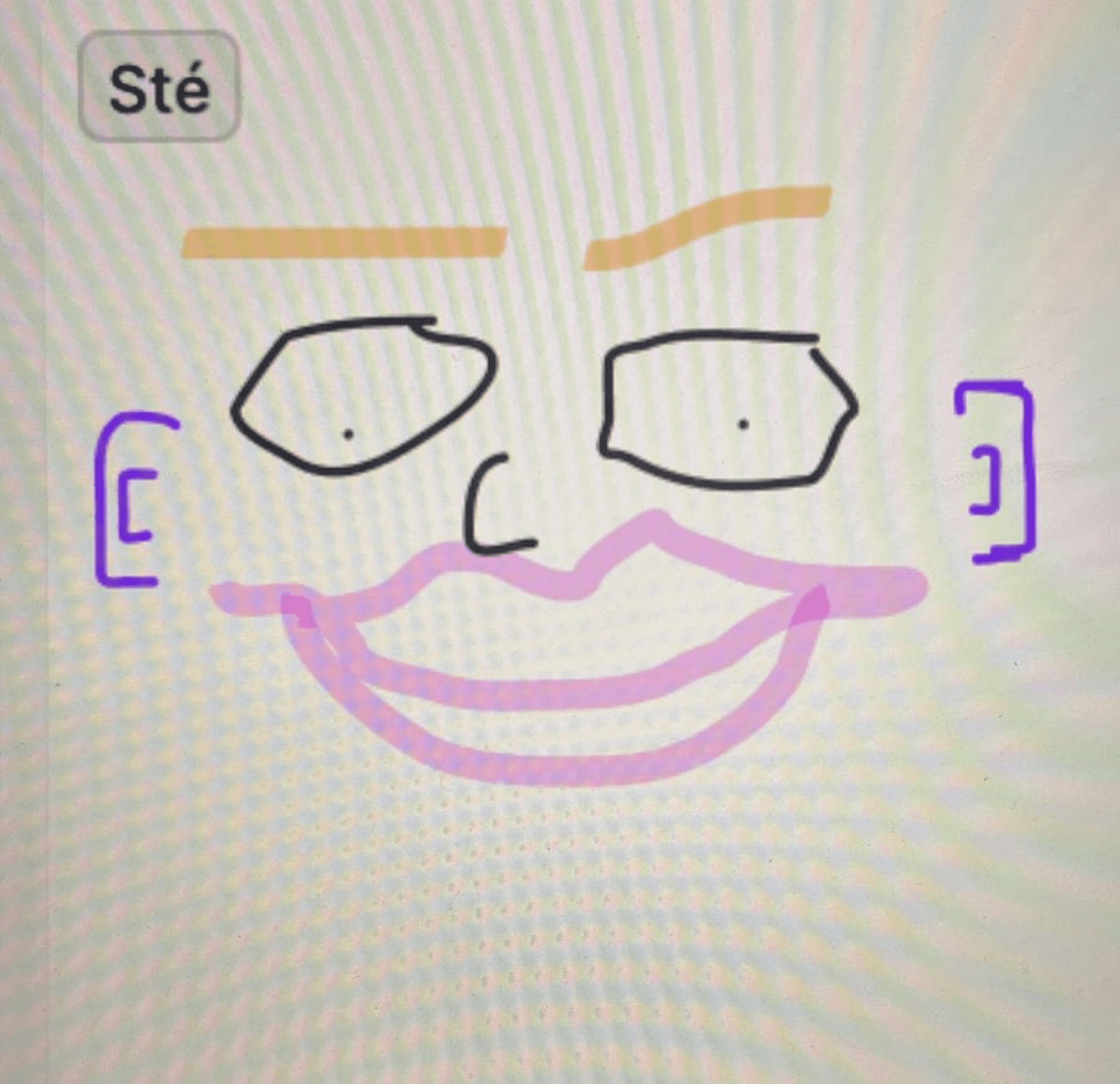
ice-breaker version of me made collectively during one workshop
thank you
thank you
________________________________________________________________________________________________
____________________________________________________________________________________
if you would like to talk about this project (or other subjects), feel free to send me a message at
stephanierts@gmail.com
project overview: revolutionizing iti's loan experience
the challenge: modernizing iti’s loan platform for young, lower-income clients while integrating Itaú’s new design system. The goal was to offer a transparent, user-friendly loan process that matched our users’ hectic lives and evolving financial needs.
my approach: I mapped out customer pain points — such as confusion over banking jargon, unclear loan terms and existing scenarios and its unfoldings — and used these insights to create a seamless, understandable loan journey for different client's moments. The solution provided transparency, financial tips, and personalized experiences, all while aligning with the bank’s business objectives, such as scaling the service and managing risk.
main outcomes
this project aimed to revolutionize Itaú’s loan platform for young, lower-income clients by creating a more user-friendly and transparent experience. Key outcomes included the integration of a new design system, simplified customer journeys, and tools to promote financial health for our clients. The design was iterated based on research, resulting in improved customer trust and higher loan uptake. Achieving a 95% usability score, the project successfully modernized the platform while aligning with business goals like scalability and profitability. It also served ad a role model for the bank's next product hubs, being the first born under constant monitoring for improvement.
who was I in the team?
an external UX designer consultant responsible for the ideation and creation of a new loan's home for iti's* app. This was a high-stakes project, as the loans unit was one of Itaú’s top revenue drivers. I had to balance modernizing the user experience with integrating the new design system and supporting business goals in an ongoing, live product.
* iti is a free digital bank with Itaú's security, and Itaú is the largest financial conglomerate in the Southern Hemisphere
project goal
bringing financial health to the customer by offering the best credit proposal for them to achieve their goals, while achieving profitability and scalability for our business.
sales objectives
boost production (in MM/R$)
increase the number of loans taken, combined with the bank's new credit policy
mitigate the risk of default through customer credit profile analysis
who were we doing it for?
our primary users were young professionals (ages 15–29, about 29 million possible customers in Brazil) from lower-income backgrounds, often informal entrepreneurs. Their financial health was fragile, and they needed a platform that spoke their language and respected their time. By creating a relatable and accessible loan experience, we aimed to help them meet their financial goals while ensuring the bank's profitability.
👆 touch to check the available limit scenario's prototype
strategies behind the new home
I had just joined the team when I was immediately handed a major task: our squad was about to rebuild the loan's home, and I was going to help shape it. With little context about the decision, I couldn’t help but wonder — was this just about creating a beautiful UI, or was there a deeper focus on improving the client's experience? To get to the bottom of it, I asked a ton of questions, determined to understand the bigger picture. What I uncovered was more complex than I expected: a series of critical structural factors had led us to this moment.
1.
technology infrastructure
our current technology was built aiming on just one product (loan)
because the first idea was having just one product, we were using a monolithic code structure (faster to implement at the time it was built, harder to mantain through the evolution and expansion of the loan unit)
this structure did not allow integration with some of our microservices and did not guarantee the agility we needed to change, no longer supporting business planning for various functionalities, subproducts and eventual quick wins
we needed to build a different infrastructure to ensure superior performance and compatibility with current market demands
2.
design system development
Itaú’s design system was so new that our project was one of the first in the bank to develop a product using its guidelines
the new loan’s home would act as a testing ground to integrate and refine this system, setting a strong foundation for consistent future implementations
3.
business learning laboratory
the new loan's home wasn’t just a product — it was designed as a laboratory to explore and test critical aspects of our business:
we were one of the first teams tasked with evaluating how the new design system affected user experience. This meant navigating a mixed interface, where the old and new UI coexisted. It was essential to test this hybrid experience in real-time before rolling it out across the entire app
beyond design, we had to constantly assess how backend improvements influenced user behavior and performance metrics. These changes would directly impact not only the customer experience but also our development efforts and overall ROI
additionally, our team needed to conduct a deep analysis of how the new home affected the sales funnel. We should be able to identify what worked well and where improvements were needed after it went live
all of this was happening in a fast-changing scenario. The loans unit was one of the bank’s two most profitable areas, so we had to ensure that we maintained, or even improved, performance — all while overhauling the entire system structure
4.
iteration and continuous improvement
by comparing ever new data with previously collected metrics, we planned to iterate and continuously refine the loan's home over time
this approach would enable us to make adjustments based on real, actionable insights, ensuring the platform evolved in a way that better met both user needs and our business objectives
clients x loans: highlights from past researches
while navigating through the research, I developed a rationale by breaking down the client's journey into key moments, each with specific questions in mind. This approach helped me better understand the Jobs to Be Done (JTBD) when taking out a loan, guiding me toward building a solution that truly aligned with our customers' needs
being new to both the loans universe and the project, I decided to dive into the available past research from our research team. This gave me the depth and context I needed to better understand the challenges ahead. My main findings were:
our customers often feel like they have a distant and cold relationship with their bank(s)
the major issue isn't during the hiring process (although there's much room for improvement)
our customers needed help to better organize themselves financially to avoid getting tangled up
loans have a very negative connotation in Brazilian people's lives no matter for what reason it's taken
customers wanted the bank to celebrate with them when they were up to date
clients often feel like the bank 'punishes' those who pay off the loan (doesn't provide any more credit afterwards)
customers felt like we applied quick and incessant pressure for delays on payments
clients felt that the digital environment brought even more coldness and distance
ok! now, based on our data, how could we offer a WOW experience to our client?
1.
more warmth and more knowledge sharing
customers miss the bank sharing more tips about its expertise (finance) so they would be able to make informed decisions alone
2.
security in product choice
we could develop the customer for our product ecosystem without the negative weight of the choice, and help them see themselves on another level
3.
assistance with finances beyond the loan
we could help our customers gain a clearer view of their financial health by sharing original content or partnering with influencers who speak their language. For instance, we could collaborate with influencers like Nath Finanças, a well-known Brazilian figure who helps young people from lower-income households achieve their financial goals
4.
more clarity in information
the Nubank case - in one of the interviews with the research team, a customer shared that after a year of using Nubank's service without a credit card, she applied for one and was approved with a limit of just R$50,00*. Along with the card, she received an explanation of why her credit limit was so low. Surprisingly, she agreed with the analysis, realizing that she wasn’t in a financial position to manage a higher credit limit at that time
* R$ 50,00 = $10,00, approximately
our steps towards launching our rocket ship
1. certainties, suppositions, and doubts
to gain an even deeper understanding of the problem (being NASA isn't easy after all), I facilitated two design thinking sessions with the teams. These sessions helped us identify our certainties, challenge our assumptions, and highlight areas where we had doubts. This set the foundation for clearer direction moving forward
2. value proposition
we co-designed our value proposition in collaboration with the teams involved in the development stages. This helped us align on what was feasible in terms of cross-deliveries, as some of our work depended on deliverables from other teams. It ensured that everyone had a shared vision of the value we aimed to create
3. scenarios and use cases
using the insights from the earlier sessions, we mapped out key scenarios and use cases. This helped us focus on the most important user journeys and how our product would address their needs in real-world situations
4. design business critique
as we continued to design our ideal journey-to-be, it became essential to define and refine certain business rules. To facilitate this, I led several sessions between our squad and stakeholders, a process I called "business critique” (yes, a design critique, but to discuss the business directions). Instead of waiting until the end of the design process to show it to our stakeholders (a common practice at the time that resulted in many work re-dos), I decided to try bringing them into the process much earlier to align on strategy and ensure feasibility from the start
evaluating our requisites and as-is to make better decisions
main scenarios - before

the old loan home had its quirks — like showing an "active contracts" section even when there were no contracts to display, thanks to the rigid structure of the interface. It was a little awkward, to say the least. Another pain point was the lack of guidance for users trying to improve their credit limit. Not everyone was given the option to see what actions they could take, which left many feeling frustrated and powerless in their own financial journey.
the new home, though, was designed with flexibility and personalization at its core. We made sure users would only see relevant options based on their specific situation, and we clearly laid out the steps they could take to increase their available limit. No more dead ends or confusion — just a seamless, tailored experience that put users in control.

loan simulation - before
5 principles that guided our ideas
in the process of developing our product, we knew that a strong foundation was key to ensuring success. To guide our decisions and keep our goals clear, we relied on five core principles. These principles not only shaped our internal discussions but also drove our benchmarking efforts, helping us compare our ideas with industry standards and best practices. By staying true to these guiding concepts, we were able to align our creative process with both user needs and business objectives, paving the way for a product that was as innovative as it was impactful.
1. customer's time is precious
our solution should always simplify or streamline the customer experience, even if it becomes more complex for the bank. #efficiency
2. context in favor of the customers
always use the information the bank has to ease customer's life, anticipating their needs and desires.
#anticipation
3. customers in control
customers need to be able to complete the entire experience through digital channels, having visibility and control over each step of the process.
#autonomy
4. speak customer's language
communication should be clear and objective throughout the experience, inspiring confidence. #transparency #simplicity
#security
5. sequential and holistic
think about everything that can happen to the customer during their journey: what should go right, what can go wrong, and how to solve it in the best way.
#systemic thinking
each of these five principles was rated from -1 to +1 while evaluating other players’ journeys. Then, we evaluated our own product the same way, and summed up all the scores to compare all the players disposed in a single chart. This has helped us understand the best strategies being developed on the market, where we were located in terms of the best experiences, and what else we could do to improve our product.
studying our competition: main conclusions and insights
highlights
most competitors used questionnaires to understand the motivations behind loan requests, helping to better understand the customer's needs
iti did not provide a sense of how many steps the process would take, and although we used a linear journey, not being clear about the next steps reduced customer control over the process, caused fear (of hiring a loan unintentionally after the next step) and required some back and forth readjustments when editing the loan's configuration during the simulation
some competitors used a calendar context for date selection, facilitating deadline identification. We knew this wasn't a possibility at the time due to some restraints in our available dates policy, but we could try to make the date selection easier
Neon and Nubank were the most transparent about the requested amount and the final amount with interest. Itaú's superapp showed the installment amount only, not the total price, impacting the decision-making time
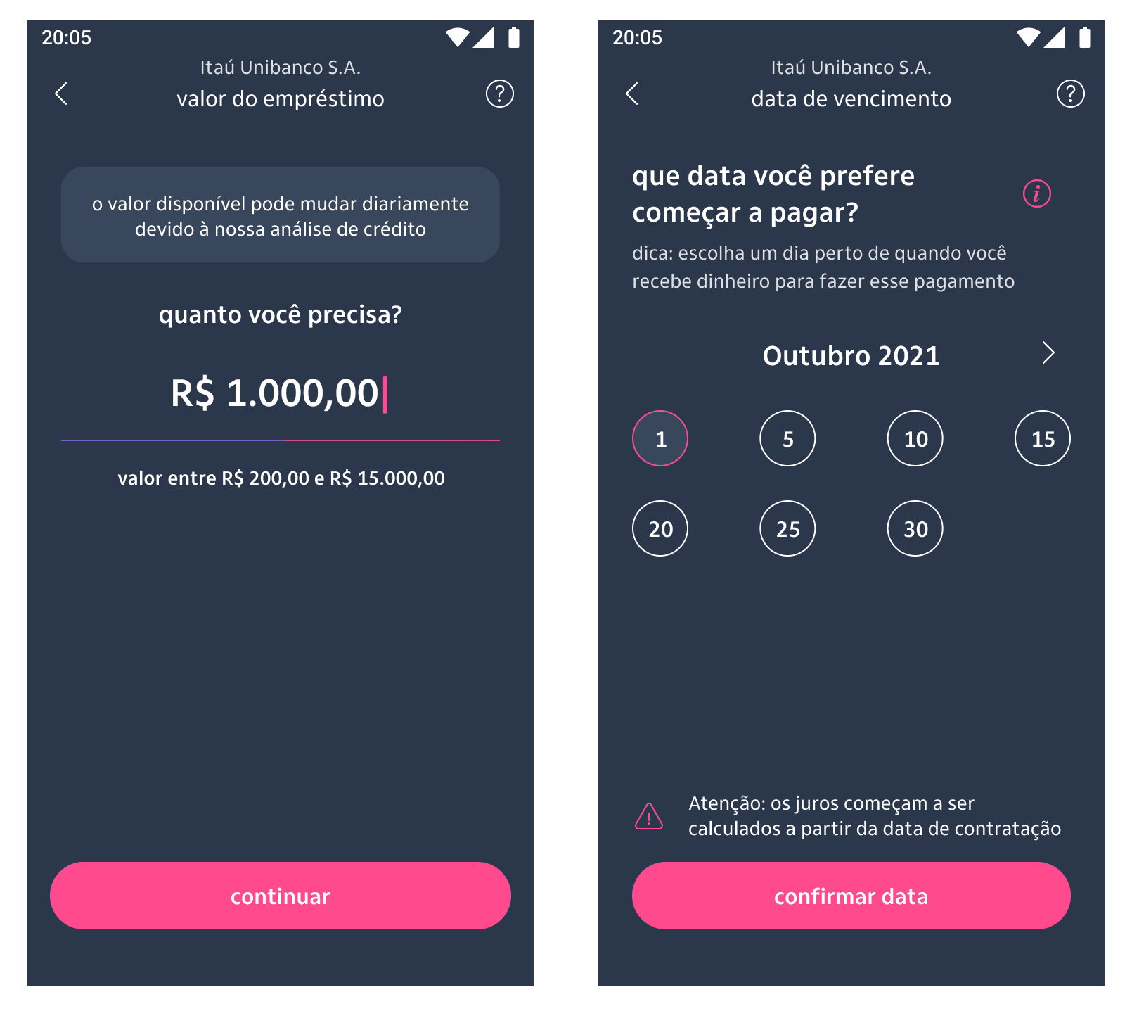
initiating launch protocols
when I began designing the interfaces for the new loan home, I opted not to start with low-fidelity wireframes, as the business team was highly focused on the final look and feel of the screens. Knowing that building high fidelity upfront was going to take a lot of time and open possibilities for having to redo a lot of stuff, I chose to speed up my process by using the components already available from our new design system, assessing whether additional elements would need to be developed within our squad or if they could be delivered in a second version (given our tight timeline, we didn’t have time to reinvent the wheel).
a few details on the available limit screen that were iterated throughout the process
the concept of mapping the client's key moments and presenting a different scenario for each one had proven successful when I presented it to the team, so I championed that approach over delivering a facelifted and slightly improved version of the old way through (that would take much less time to build but would also not solve our issues). Throughout the process, some components were evolving even as I was designing, making it a dynamic, iterative task.
a few versions of the available limit screen that were iterated throughout the process
👆 touch to check the available limit scenario's prototype
main home scenarios - after
guerrilla: evaluating the perception of our screens
why did we choose this format?
this was a priority project (one of the bank's highest-yielding units and product)
there was a budget gap to use our external research lab (requirement for conducting all our usability tests) for the following two months, and we needed to test at least something before developing
the recruitment, selection, and customer interviews were conducted by me in collaboration with the research team - so no extra cost needed
highlights
1. customers were able to easily perceive the differences between messages for on-time payments, overdue payments, available limit and no available limit
although subtle, messages with different nuances in the overdue scenario were noticed and understood by customers as something requiring more or less urgency of action
2. it became clear to customers what steps they could take to obtain credit
98% of customers attempting credit are denied on the first try due to a lack of a stronger relationship with the bank; our intention was to make clear the actions that could directly impact their chances of obtaining credit
3. the speed along with the clarity of the hiring process were considered positive points
customers praised the process and believe that, in general, we were able to set aside the "banking jargon" and make the information about the loan clear before contracting
4. financial tips were considered a bank differentiator
despite not being the first bank to offer this feature, customers report it as something unprecedented for them and found the existence of these tips useful and relevant
attention points

usability test: SUM
why did we choose this format?
when we were almost finishing our development, the design team in Itaú was making SUM the main evaluation criteria for every journey, so we could always have concrete data about time calculations and client's actual performance to use as basis for our next improvements and iterations
since we weren't able to do a usability test before, this was also a great opportunity to understand our performance in a real world scenario with our customers
it would help us measure both the performance of our journeys and the satisfaction of our clients, giving us more in-depth knowledge for next steps
based on the results of the SUM usability test, the product achieved an outstanding final score of 95%, indicating a highly effective user experience. This score reflects users' ability to navigate the interface with ease and complete key tasks efficiently, with minimal friction throughout their interactions. The results underscore the success of the design in meeting both usability standards and user expectations, positioning the product as well-optimized for launch with only minor adjustments required to further enhance user satisfaction.
to infinity and beyond
the positive feedback and high satisfaction rates guided targeted improvements to ensure the product continued to meet user needs effectively. These steps involved fine-tuning the interface, addressing any minor usability challenges, and preparing for the product's hub broader release. By maintaining this momentum, we aimed to drive greater user engagement and long-term success.
implementation
this project's MVP went on air after 8 sprints of work
development of subproducts
while the thecnology team built our MVP, we have developed a roadmap of features and subproducts to attach in our loan's home later on, after the results and new iterations started to come in
monitoring metrics/OKRs
user experience success: our solution achieved a 95% usability score in the SUM test, underscoring the ease and effectiveness of our design. The redesigned loan journey reduced decision friction, improved customer trust, and drove higher engagement
business impact: the project boosted loan uptake within the first quarter, meeting key business objectives like production volume and profitability (real data is confidential and can't be shared)
loan's home evolutions
product hubs have been developed after the guidelines we first defined on loan's home; we were building the first product hub of iti (and we didn't know yet)
further development of our design language / design system, and implementation of revisited clients’ journeys using new and improved components
development of cross-team components, in partnership with the Design Ops team
I was part of the team working for the standardization of all product hubs later on
loan hub after the hub's standardization process
reflecting upon this experience, I improved my:
adaptability in unknown scenarios
successfully navigated ambiguity and independently resolved challenges by identifying the right questions, stakeholders, and resources
reduced the time to adapt to new processes by creating a personal framework for quickly gathering essential information
delivered functional designs aligned with stakeholder expectations, even in the absence of formal Design System (DS) training
influence on the team
collaborated with designers across different product areas to identify a pattern that naturally aligned with the bank’s long-term architecture goals (product hubs)
contributed to the emergence of product hubs, a structure that became a reference for the bank's unified architecture months ahead of official implementation
this analysis informed cross-functional decisions and laid the groundwork for scalable product structures
decision-making process
proactively sought information from other teams, peers, and DS focal points to address knowledge gaps and align design decisions
developed a deep understanding of the bank’s ecosystem and loan products, allowing me to make informed design choices despite limited access to strategic meetings or initial data
reduced confusion within the squad by initiating alignment efforts, which led to faster adoption of the new DS and smoother product development cycles
quick learning of new hard skills
overcame a knowledge gap by completing targeted external courses, attending lectures, and studying documentation on UI kits and DS best practices
applied new skills immediately to build interfaces that adhered to the bank's evolving DS guidelines
ice-breaker version of me made collectively during one workshop
thank you
__________________________________________
if you would like to talk about this project (or other subjects), feel free to send me a message at
stephanierts@
gmail.com