favela insurance: designing financial protection where it didn’t exist before
favela insurance: designing financial protection where it didn’t exist before
building Brazil’s first favela-focused insurtech — from whiteboard to public launch
8 min read
project overview
in mid-2024, I was invited to design a new kind of insurance product. Not to improve one — to build it, from scratch.
the favela insurance project was born inside a big, traditional insurance company as a startup pilot. The goal: bringing accessible life and funeral insurance to favelas across Brazil — communities where insurance is either invisible, or barely trusted. We had only 3 months (later turned into 5), limited tech resources, and a question to answer: can we build something truly protective, and not extractive?
in this study case, you will read about how I helped in the birth of the first microinsurance platform built for favela communities in Brazil. Focused on life and funeral coverage, it was designed to be accessible, affordable, and culturally relevant — meeting people where they are, in the language they speak, with the tools they already use.
I worked as the Founding Product Designer across the entire journey — from research to validation to handoff. In the end, I also designed their public-facing website.

designed for the street, not the screen — helping sales agents guide clients with confidence
the outcomes
in short, the final results that we delivered (until launch, after 5 months of work) were:
a 25% improvement in sales efficiency (in relation to an adapted tool used by the sales team during the product's pilot testings)
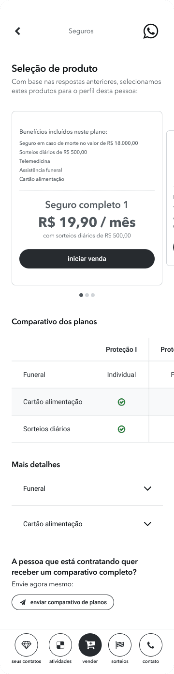
a life + funeral insurance product with benefits ranging from R$10K to R$50K and integrated services like telemedicine and food vouchers (in case of death of the insurance holder)
fully digital enrollment, no paperwork
a real, usable insurance product for communities long ignored by this industry
a public-facing site for institutional partners and public awareness
favela insurtech also became a testing lab for the mother company — their first use of facial recognition as a validation for hiring a product, their first door-to-door onboarding flow and their first product designed with and for this audience.
1. understanding the field
favela residents often live in high-risk environments — exposed to violence, fires, floods — with rare access to insurance. Not because they don’t want it, but because the system wasn’t built for them. The barriers are numerous:
they usually have no formal credit history or fixed address
insurance companies offer monthly plans that don’t fit irregular incomes
industry uses overly legal, inaccessible language (the 'legalese')
residents have deep-rooted mistrust in financial institutions
“In the favela, we’re thinking about today. Insurance only makes sense if it helps with something real — like a funeral.”

first day in the field — listening, exploring and learning
I was given just one week to design the entire product. This was not very realistic and it felt like I was already out of time and should start sketching something from day 1, but I chose to take the first step by going to the field and listening to real people — it wouldn't make sense otherwise. I needed to know their struggles, pains and desires, first hand.
most families I spoke to had some kind of funeral insurance. Not because they trusted the system — but because not having it often meant not being able to bury loved ones. Life insurance, on the other hand, felt distant. Unreachable. We needed a product that was:
affordable even for informal workers
technologically simple
culturally and emotionally relevant
designed to work offline during the sale process — for real, as connectivity can be limited in some regions
I built the structure around those realities — mapping journeys, conducting field research, drafting hypotheses, and iterated wireframes with the tech team and stakeholders.
2. research & insights
methods:
during 2 days, I have shadowed sales reps during door-to-door visits
I spoke informally with residents in community centers, commerces, and on the streets
what I heard:
people want protection — especially for their families
funeral coverage was already familiar and accepted
trust was the biggest hurdle: “What if I pay, and it disappears?”
and a key assumption challenged:
most users already had some kind of insurance (mostly funeral). That became our entry point — not a barrier.
“I have a funeral insurance plan, but I don’t really understand what it covers. It always feels like there’s some small print that makes it confusing.”
insight: trust is a major barrier. Users associate insurance with confusion and hidden conditions. Simpler, legalese-free language is critical.
“I don’t have time to go through a big application — I just want to know if I’m covered and how much it’ll cost.”
insight: users value speed and clarity. A long, form-based onboarding, or making a new app to be installed would likely cause drop-off.
“I’m used to using whatsapp to talk to businesses — it feels easier than downloading another app.”
insight: conversational UI aligns with users’ mental models of informal, trusted business interactions.
“If I can pay for Netflix, I should be able to pay to protect my kids. I just need to be sure it won’t screw me later.”
insight: users perceive insurance as a meaningful investment only if it feels trustworthy and affordable. They compare it to familiar, recurring expenses like Netflix — framing it as a small price to protect something much more important (family). Trust, transparency, and relatable pricing are essential for conversion.
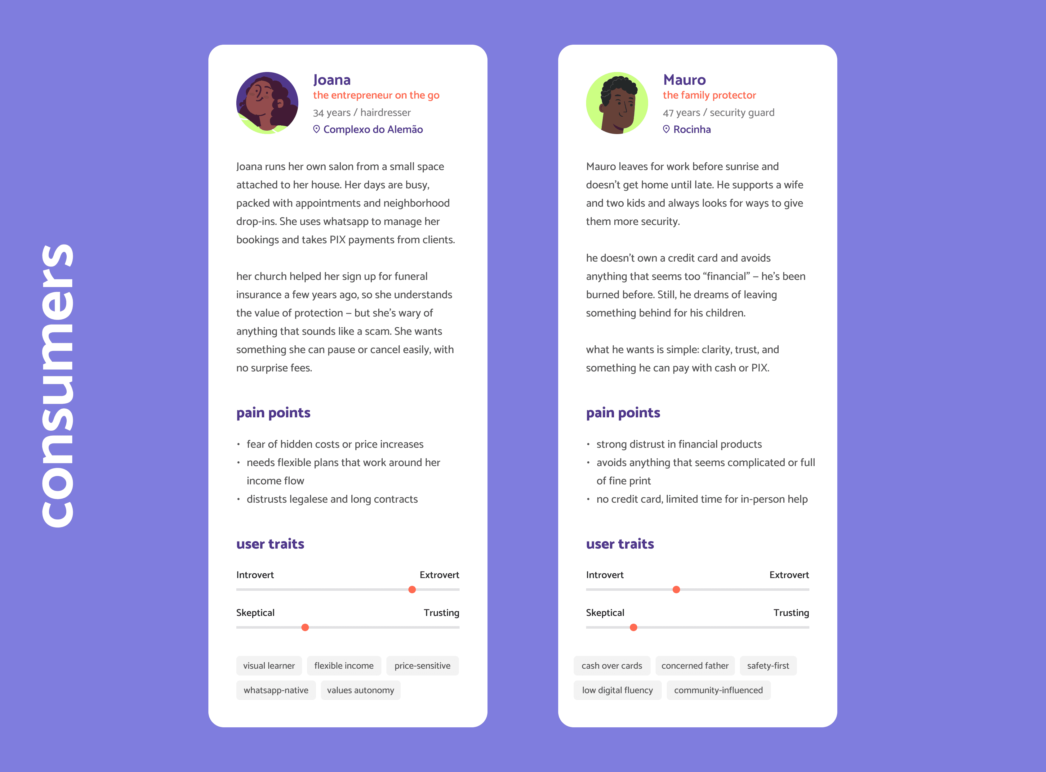
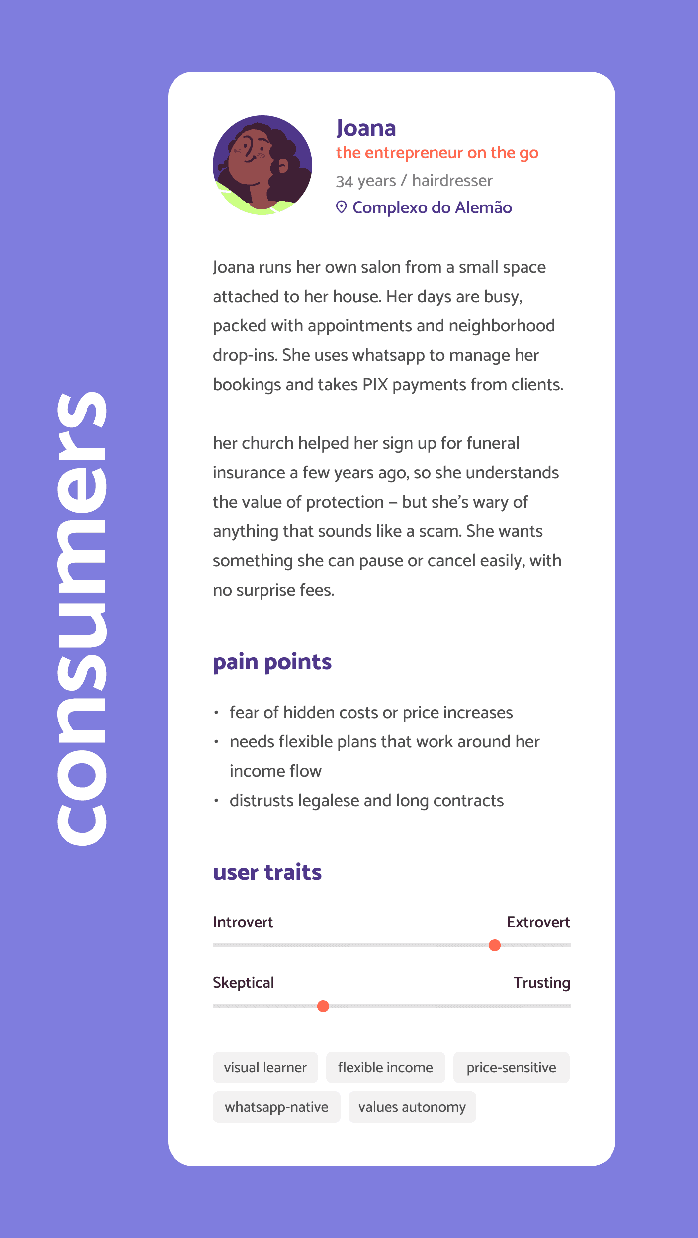
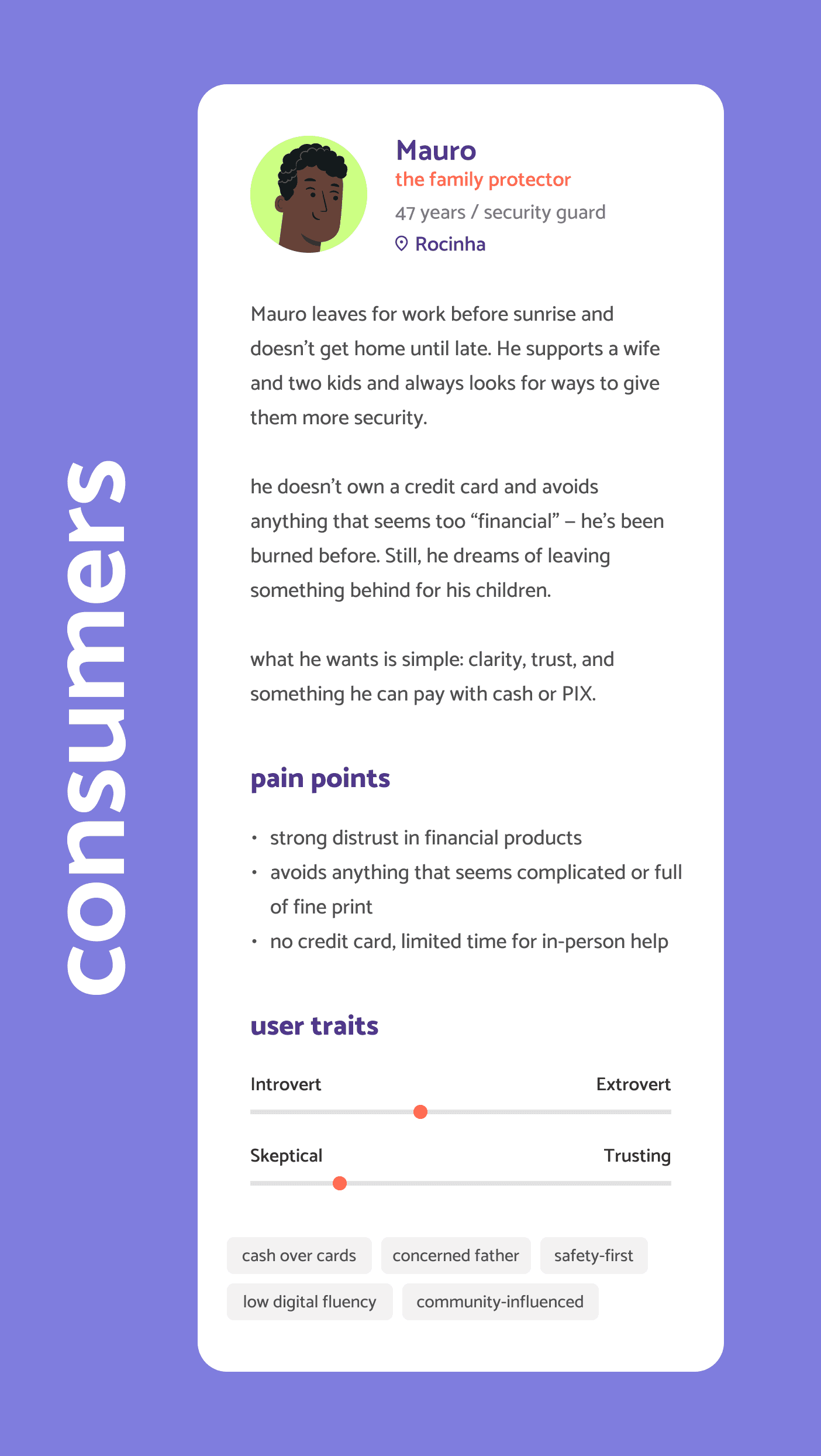
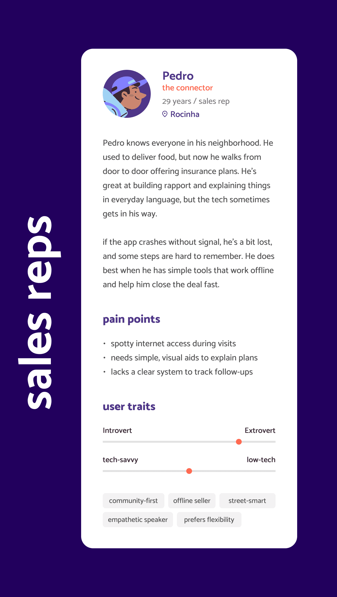
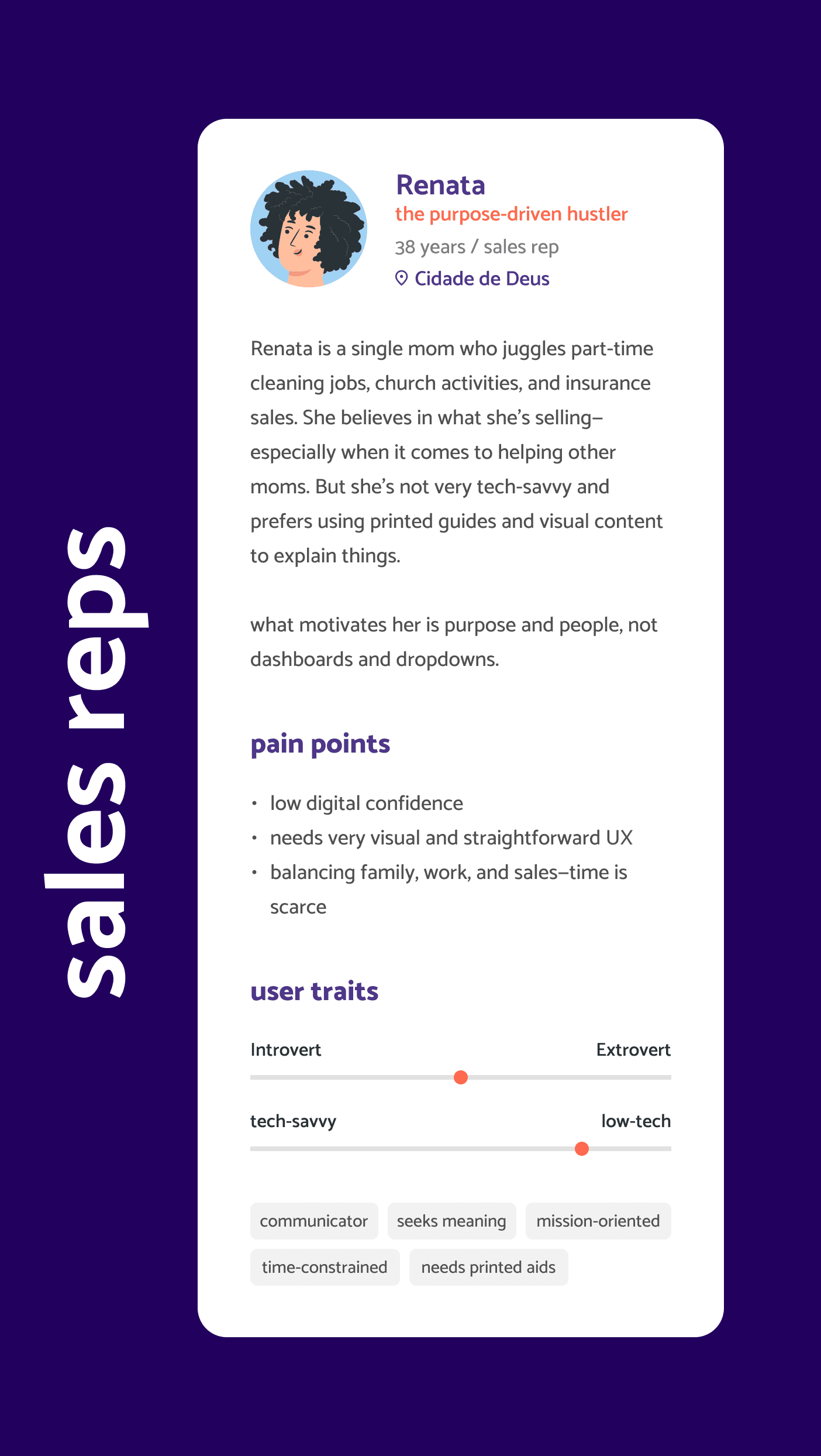
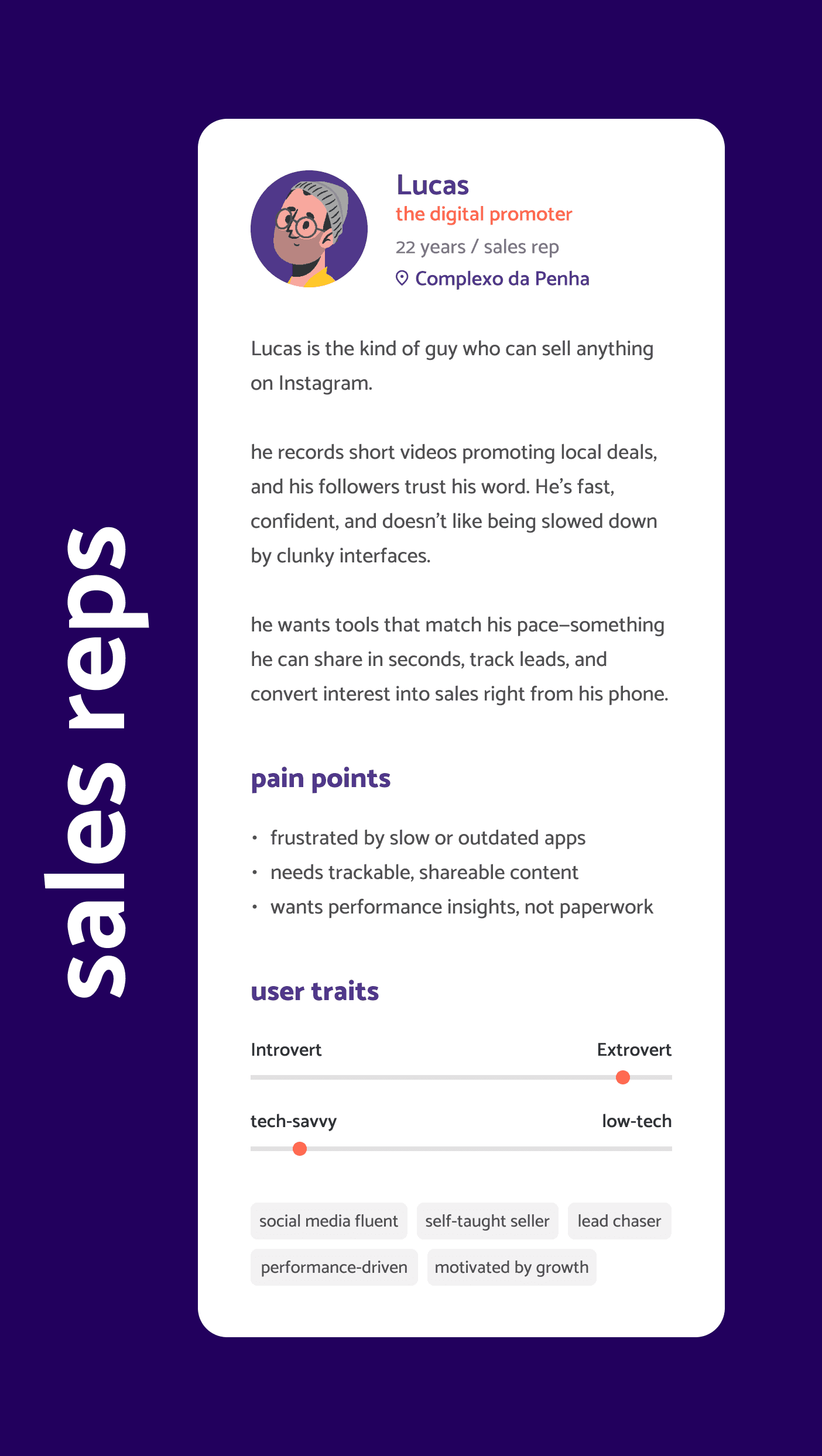
3. personas
based on these visits and posterior desk research, I have developed personas in two different approaches: the consumers (residents from the favelas) and the sales representatives (also originating from these territories, as this was a premise for the product).

4. ideation and evolution
the project then kicked off in the company with two ideation sessions. At that point, the only thing I knew was why and for whom we wanted to create this company. The what and how were still open.
together with stakeholders and the innovation PM, I co-built the foundation: a shared understanding of the context, business motivation, and early hypotheses. From there, we created a service blueprint to sketch potential journeys and surface constraints — while the product team simultaneously explored what was feasible under insurance regulations and market practices. Meanwhile, I have drawn the user flows for our main journeys — my starting point to think of how this experience should be.

example on one of user flows — starting to shape the sales experience from the ground up
remember, I had just one week to design the entire product — which would have made impossible for the outcomes to be good or fully functional. So I made a case for a different approach: let’s treat this as a design sprint. I’d define the first wireframes within that tight window — then use them as a living prototype to iterate collaboratively until me, the stakeholders and tech team reached an agreement — and our users could make good use of what we built. That proposal was accepted.
and so I did. With the first version in hand after this first week of learning, listening and sketching, we worked on it for over a month, refining each flow and screen before development began. It made alignment smoother, expectations clearer — and the solution so much more rooted in reality for both sides, company and users.

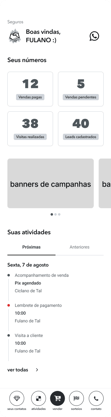
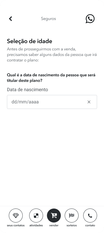
a few of the first wireframes for the sales reps tool — built in a week to move fast without rushing the wrong things. I chose to develop it in black and white to avoid distractions and keep the focus on funcionality and the journey itself instead of the UI elements. Later on, I have thought of different features like rating consumers, saving contacts of interested clients for future approaches, upselling and even a tool to reach out to the company in case the sales rep felt insecure or in danger during the sales process — but some of these features were removed from the MVP due to lack of time to develop under the deadline, and postponed to a future version of the system

5. designing with (and against) the system
we chose to develop the product using an external team that built on Microsoft Power Apps, which meant working within serious design limitations., but being able to deliver very fast. This decision was made due to the tight timeline, so we pushed. And we learned a lot.
another key decision early in the definition of the problems was using facial recognition for identity validation. It replaced manual underwriting — enabling faster approval and more accessible pricing. But facial recognition isn’t neutral. The bias is real. And when your audience is mostly black, mostly excluded, the risk becomes personal.
I advocated strongly for the algorithm with proven fairness safeguards — already used by financial services in the favelas themselves. But the company opted for one vendor already under contract. Lower cost, fewer approvals. I didn’t win that fight, but I raised it — repeatedly.
I my humbled opinion, that matters too.
6. making it work for everyone
after all these processes, I still had some questions pending: Is it a self-service product, or just sold through our vendors on-site? What if the client doesn’t have a phone? What if their camera is broken? What if they’re just scared to do this alone? How will they hire our product in these scenarios?
even on a rush and tight schedule, we couldn’t afford to design just for the one, ideal scenario. Based on knowledge from our consultants about the funeral insurance sales process inside the favelas, and on our knowledge in general about the consuming profile on insurance products, we knew that this kind of product is almost always bought through a direct vendor (regardless of income level). A salesman will be able to answer to any doubts or needs a client may have before hiring. So I proposed we created two paths for our journey:
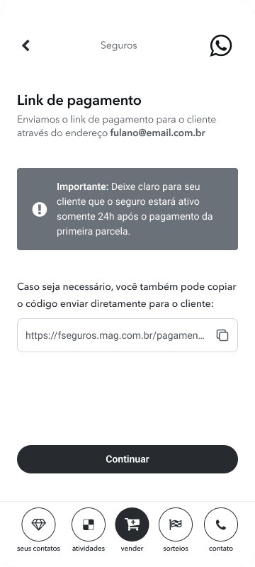
sales platform: using our sales platform, one of our sales representatives would go door-to-door in the favelas and have the possibility of helping the client complete part of the onboarding — facial recognition — in person. Then, the client would finish the payment step by themselves with a secure link (not viable of being made by a third person to guarantee an antifraud system)
payment platform: the client would receive a secure link via whatsapp or email to complete identity validation (if not done before) and payment by themselves, after purchasing
both flows were shaped to support low-tech capacity contexts, using a web-app interface. And both were tested with real users in the field.
7. key features
SALES
PLATFORM
modular plan selection with up-front pricing
address input that works with non-traditional references
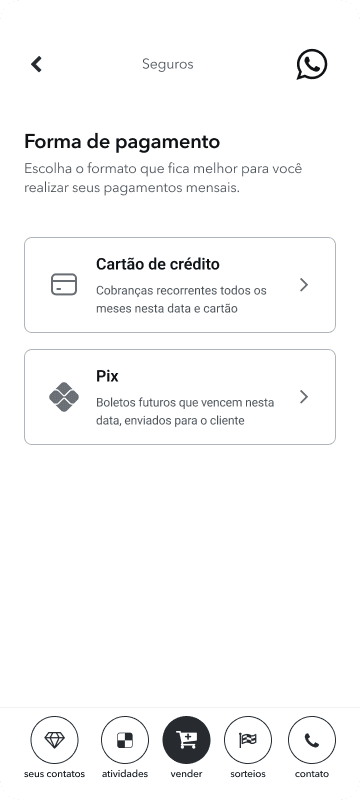
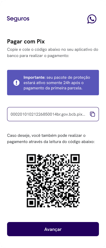
PIX payment option
offline-ready interface for reps in low-connectivity areas
PAYMENT
PLATFORM
facial recognition signature system
automatized underwriting for hiring
whatsapp integration for onboarding and claims
8. ok, but what does innovation look like here? 🔬
insurance products often rely on complex language, long forms, and a transactional tone — all barriers for favela residents with limited time or digital familiarity.
this project reframed insurance as a conversation. Through friendly microcopy, informal language, and a conversational UI modeled after apps used daily, we made insurance feel more accessible, human, and trustworthy.
9. usability-driven refinements
I conducted usability tests with 7 real users from favela communities, for each platform. We reached a 95% satisfaction score on both tests — but some insights led to key refinements. What I heard:
in these territories, postal codes didn’t always exist, so it was important to let the sale happen without one (required to ease regulations when a claim is made)
users suggested that the payment could be done in the field by reading a QR code on the payment link screen, instead of just waiting for the link to arrive (it can take a few minutes)
some clients needed help to understand the details of the plans, so it was important to use accessible language and leave explanations clear to our representatives during the process
what I changed:
✅ added “reference location” input and left CEP as an optional field
✅ added the QR code option to the final confirmation screen, increasing autonomy and flexibility for the payment process
✅ reduced steps and simplified microcopies (avoiding "legalese" as much as possible)

client onboarding for payment and facial recognition — a lightweight web app designed for low-end devices and low digital literacy


10. success metrics
the product launched shortly after finishing the development. While I left the company before full analytics could be gathered, the team reported early positive user feedback around the clarity of language and ease of sales.
given our primary goals of increasing accessibility and trust, I focused heavily on simplifying the onboarding journey and removing legal jargon — areas where we expected to see reduced drop-off. If having more time to develop, I would conduct comprehension tests with users from different favelas to validate the clarity of the product in different realities. I’d also explore whatsapp-based onboarding as an alternative entry point.
if revisiting the project, I’d recommend validating conversion rates on the onboarding flow and testing comprehension levels of the insurance details. Also, I would have loved to measure the following points in order to keep continuously improving these journeys:
number of recurring payments and plan renewals
perfomance in offline environments
curve of organic referrals via community word-of-mouth
feedbacks on the flow for reps in adverse conditions daily

key learnings
this project reinforced something I already knew: design isn’t just about interfaces or experiences — it’s about which futures we choose to normalize. And trust isn’t just earned through good UX — it’s built through familiarity.
funeral insurance, use of whatsapp, accessible language and using neighborhood landmarks became the foundation for a product that respected how people already live, pay, and protect each other.
good UX doesn’t just reduce friction — it meets people where they are.
the outcomes
in short, the final results that we delivered (until launch, after 5 months of work) were:
a 25% improvement in sales efficiency (in relation to an adapted tool used by the sales team during the product's pilot testings)
a life + funeral insurance product with benefits ranging from R$10K to R$50K and integrated services like telemedicine and food vouchers (in case of death of the insurance holder)
fully digital enrollment, no paperwork
a real, usable insurance product for communities long ignored by this industry
a public-facing site for institutional partners and public awareness
favela insurtech also became a testing lab for the mother company — their first use of facial recognition as a validation for hiring a product, their first door-to-door onboarding flow and their first product designed with and for this audience.
1. understanding the field
favela residents often live in high-risk environments — exposed to violence, fires, floods — with rare access to insurance. Not because they don’t want it, but because the system wasn’t built for them. The barriers are numerous:
they usually have no formal credit history or fixed address
insurance companies offer monthly plans that don’t fit irregular incomes
industry uses overly legal, inaccessible language (the 'legalese')
residents have deep-rooted mistrust in financial institutions
“In the favela, we’re thinking about today. Insurance only makes sense if it helps with something real — like a funeral.”
first day in the field — listening, exploring and learning
I was given just one week to design the entire product. This was not very realistic and it felt like I was already out of time and should start sketching something from day 1, but I chose to take the first step by going to the field and listening to real people — it wouldn't make sense otherwise. I needed to know their struggles, pains and desires, first hand.
most families I spoke to had some kind of funeral insurance. Not because they trusted the system — but because not having it often meant not being able to bury loved ones. Life insurance, on the other hand, felt distant. Unreachable. We needed a product that was:
affordable even for informal workers
technologically simple
culturally and emotionally relevant
designed to work offline during the sale process — for real, as connectivity can be limited in some regions
I built the structure around those realities — mapping journeys, conducting field research, drafting hypotheses, and iterated wireframes with the tech team and stakeholders.
2. research & insights
methods:
during 2 days, I have shadowed sales reps during door-to-door visits
I spoke informally with residents in community centers, commerces, and on the streets
what I heard:
people want protection — especially for their families
funeral coverage was already familiar and accepted
trust was the biggest hurdle: “What if I pay, and it disappears?”
and a key assumption challenged:
most users already had some kind of insurance (mostly funeral). That became our entry point — not a barrier.
“I have a funeral insurance plan, but I don’t really understand what it covers. It always feels like there’s some small print that makes it confusing.”
insight: trust is a major barrier. Users associate insurance with confusion and hidden conditions. Simpler, legalese-free language is critical.
“I don’t have time to go through a big application — I just want to know if I’m covered and how much it’ll cost.”
insight: users value speed and clarity. A long, form-based onboarding, or making a new app to be installed would likely cause drop-off.
“I’m used to using whatsapp to talk to businesses — it feels easier than downloading another app.”
insight: conversational UI aligns with users’ mental models of informal, trusted business interactions.
“If I can pay for Netflix, I should be able to pay to protect my kids. I just need to be sure it won’t screw me later.”
insight: users perceive insurance as a meaningful investment only if it feels trustworthy and affordable. They compare it to familiar, recurring expenses like Netflix — framing it as a small price to protect something much more important (family). Trust, transparency, and relatable pricing are essential for conversion.
3. personas
based on these visits and posterior desk research, I have developed personas in two different approaches: the consumers (residents from the favelas) and the sales representatives (also originating from these territories, as this was a premise for the product).
4. ideation and evolution
the project then kicked off in the company with two ideation sessions. At that point, the only thing I knew was why and for whom we wanted to create this company. The what and how were still open.
together with stakeholders and the innovation PM, I co-built the foundation: a shared understanding of the context, business motivation, and early hypotheses. From there, we created a service blueprint to sketch potential journeys and surface constraints — while the product team simultaneously explored what was feasible under insurance regulations and market practices. Meanwhile, I have drawn the user flows for our main journeys — my starting point to think of how this experience should be.
example on one of user flows — starting to shape the sales experience from the ground up
remember, I had just one week to design the entire product — which would have made impossible for the outcomes to be good or fully functional. So I made a case for a different approach: let’s treat this as a design sprint. I’d define the first wireframes within that tight window — then use them as a living prototype to iterate collaboratively until me, the stakeholders and tech team reached an agreement — and our users could make good use of what we built. That proposal was accepted.
and so I did. With the first version in hand after this first week of learning, listening and sketching, we worked on it for over a month, refining each flow and screen before development began. It made alignment smoother, expectations clearer — and the solution so much more rooted in reality for both sides, company and users.
a few of the first wireframes for the sales reps tool — built in a week to move fast without rushing the wrong things. I chose to develop it in black and white to avoid distractions and keep the focus on funcionality and the journey itself instead of the UI elements. Later on, I have thought of different features like rating consumers, saving contacts of interested clients for future approaches, upselling and even a tool to reach out to the company in case the sales rep felt insecure or in danger during the sales process — but some of these features were removed from the MVP due to lack of time to develop under the deadline, and postponed to a future version of the system
5. designing with (and against) the system
we chose to develop the product using an external team that built on Microsoft Power Apps, which meant working within serious design limitations., but being able to deliver very fast. This decision was made due to the tight timeline, so we pushed. And we learned a lot.
another key decision early in the definition of the problems was using facial recognition for identity validation. It replaced manual underwriting — enabling faster approval and more accessible pricing. But facial recognition isn’t neutral. The bias is real. And when your audience is mostly black, mostly excluded, the risk becomes personal.
I advocated strongly for the algorithm with proven fairness safeguards — already used by financial services in the favelas themselves. But the company opted for one vendor already under contract. Lower cost, fewer approvals. I didn’t win that fight, but I raised it — repeatedly.
I my humbled opinion, that matters too.
6. making it work for everyone
after all these processes, I still had some questions pending: Is it a self-service product, or just sold through our vendors on-site? What if the client doesn’t have a phone? What if their camera is broken? What if they’re just scared to do this alone? How will they hire our product in these scenarios?
even on a rush and tight schedule, we couldn’t afford to design just for the one, ideal scenario. Based on knowledge from our consultants about the funeral insurance sales process inside the favelas, and on our knowledge in general about the consuming profile on insurance products, we knew that this kind of product is almost always bought through a direct vendor (regardless of income level). A salesman will be able to answer to any doubts or needs a client may have before hiring. So I proposed we created two paths for our journey:
sales platform: using our sales platform, one of our sales representatives would go door-to-door in the favelas and have the possibility of helping the client complete part of the onboarding — facial recognition — in person. Then, the client would finish the payment step by themselves with a secure link (not viable of being made by a third person to guarantee an antifraud system)
payment platform: the client would receive a secure link via whatsapp or email to complete identity validation (if not done before) and payment by themselves, after purchasing
both flows were shaped to support low-tech capacity contexts, using a web-app interface. And both were tested with real users in the field.
7. key features
SALES
PLATFORM
modular plan selection with up-front pricing
address input that works with non-traditional references
PIX payment option
offline-ready interface for reps in low-connectivity areas
PAYMENT
PLATFORM
facial recognition signature system
automatized underwriting for hiring
whatsapp integration for onboarding and claims
8. ok, but what does innovation look like here? 🔬
insurance products often rely on complex language, long forms, and a transactional tone — all barriers for favela residents with limited time or digital familiarity.
this project reframed insurance as a conversation. Through friendly microcopy, informal language, and a conversational UI modeled after apps used daily, we made insurance feel more accessible, human, and trustworthy.
9. usability-driven refinements
I conducted usability tests with 7 real users from favela communities, for each platform. We reached a 95% satisfaction score on both tests — but some insights led to key refinements. What I heard:
in these territories, postal codes didn’t always exist, so it was important to let the sale happen without one (required to ease regulations when a claim is made)
users suggested that the payment could be done in the field by reading a QR code on the payment link screen, instead of just waiting for the link to arrive (it can take a few minutes)
some clients needed help to understand the details of the plans, so it was important to use accessible language and leave explanations clear to our representatives during the process
what I changed:
✅ added “reference location” input and left CEP as an optional field
✅ added the QR code option to the final confirmation screen, increasing autonomy and flexibility for the payment process
✅ reduced steps and simplified microcopies (avoiding "legalese" as much as possible)
client onboarding for payment and facial recognition — a lightweight web app designed for low-end devices and low digital literacy
10. success metrics
the product launched shortly after finishing the development. While I left the company before full analytics could be gathered, the team reported early positive user feedback around the clarity of language and ease of sales.
given our primary goals of increasing accessibility and trust, I focused heavily on simplifying the onboarding journey and removing legal jargon — areas where we expected to see reduced drop-off. If having more time to develop, I would conduct comprehension tests with users from different favelas to validate the clarity of the product in different realities. I’d also explore whatsapp-based onboarding as an alternative entry point.
if revisiting the project, I’d recommend validating conversion rates on the onboarding flow and testing comprehension levels of the insurance details. Also, I would have loved to measure the following points in order to keep continuously improving these journeys:
number of recurring payments and plan renewals
perfomance in offline environments
curve of organic referrals via community word-of-mouth
feedbacks on the flow for reps in adverse conditions daily
key learnings
this project reinforced something I already knew: design isn’t just about interfaces or experiences — it’s about which futures we choose to normalize. And trust isn’t just earned through good UX — it’s built through familiarity.
funeral insurance, use of whatsapp, accessible language and using neighborhood landmarks became the foundation for a product that respected how people already live, pay, and protect each other.
good UX doesn’t just reduce friction — it meets people where they are.

thank you
thank you
________________________________________________________________________________________________
____________________________________________________________________________________
if you would like to talk about this project (or other subjects), feel free to send me a message at
stephanierts@gmail.com

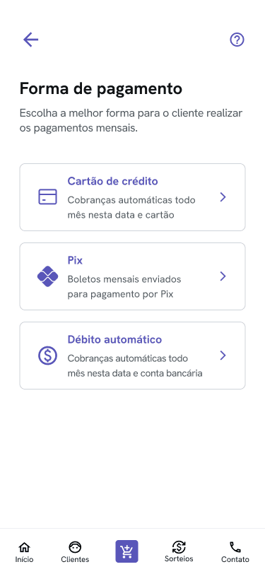
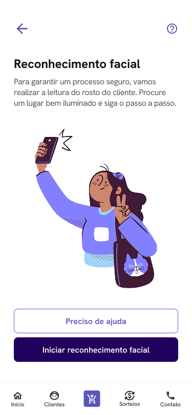
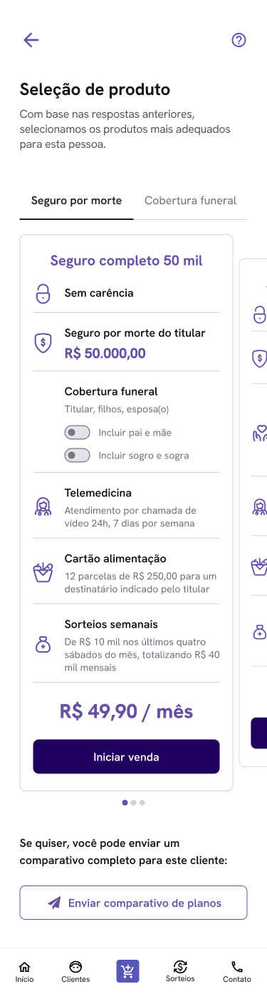
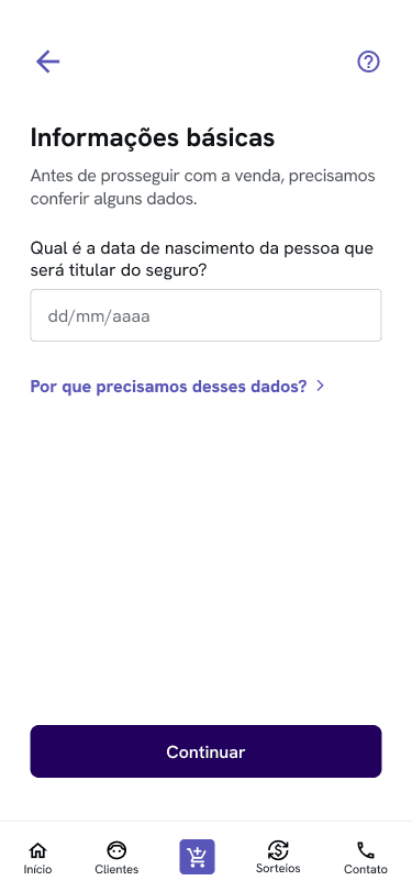
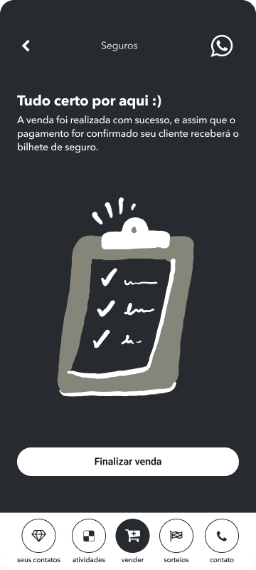
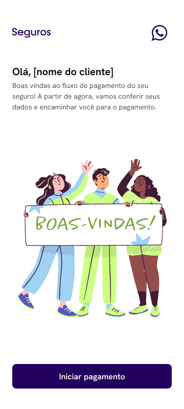
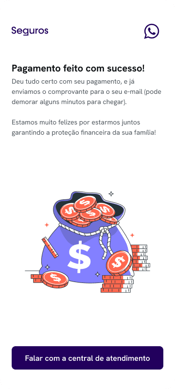
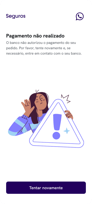
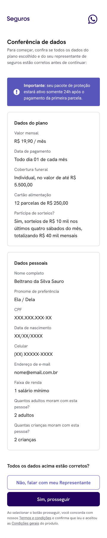
main screens from sales journey for representatives
project overview
in mid-2024, I was invited to design a new kind of insurance product. Not to improve one — to build it, from scratch.
the favela insurance project was born inside a big, traditional insurance company as a startup pilot. The goal: bringing accessible life and funeral insurance to favelas across Brazil — communities where insurance is either invisible, or barely trusted. We had only 3 months (later turned into 5), limited tech resources, and a question to answer: can we build something truly protective, and not extractive?
in this study case, you will read about how I helped in the birth of the first microinsurance platform built for favela communities in Brazil. Focused on life and funeral coverage, it was designed to be accessible, affordable, and culturally relevant — meeting people where they are, in the language they speak, with the tools they already use.
I worked as the Founding Product Designer across the entire journey — from research to validation to handoff. In the end, I also designed their public-facing website.
designed for the street, not the screen — helping sales agents guide clients with confidence
the outcomes
in short, the final results that we delivered (until launch, after 5 months of work) were:
a 25% improvement in sales efficiency (in relation to an adapted tool used by the sales team during the product's pilot testings)
a life + funeral insurance product with benefits ranging from R$10K to R$50K and integrated services like telemedicine and food vouchers (in case of death of the insurance holder)
fully digital enrollment, no paperwork
a real, usable insurance product for communities long ignored by this industry
a public-facing site for institutional partners and public awareness
favela insurtech also became a testing lab for the mother company — their first use of facial recognition as a validation for hiring a product, their first door-to-door onboarding flow and their first product designed with and for this audience.
1. understanding the field
favela residents often live in high-risk environments — exposed to violence, fires, floods — with rare access to insurance. Not because they don’t want it, but because the system wasn’t built for them. The barriers are numerous:
they usually have no formal credit history or fixed address
insurance companies offer monthly plans that don’t fit irregular incomes
industry uses overly legal, inaccessible language (the 'legalese')
residents have deep-rooted mistrust in financial institutions
“In the favela, we’re thinking about today. Insurance only makes sense if it helps with something real — like a funeral.”
first day in the field — listening, exploring and learning
I was given just one week to design the entire product. This was not very realistic and it felt like I was already out of time and should start sketching something from day 1, but I chose to take the first step by going to the field and listening to real people — it wouldn't make sense otherwise. I needed to know their struggles, pains and desires, first hand.
most families I spoke to had some kind of funeral insurance. Not because they trusted the system — but because not having it often meant not being able to bury loved ones. Life insurance, on the other hand, felt distant. Unreachable. We needed a product that was:
affordable even for informal workers
technologically simple
culturally and emotionally relevant
designed to work offline during the sale process — for real, as connectivity can be limited in some regions
I built the structure around those realities — mapping journeys, conducting field research, drafting hypotheses, and iterated wireframes with the tech team and stakeholders.
2. research & insights
methods:
during 2 days, I have shadowed sales reps during door-to-door visits
I spoke informally with residents in community centers, commerces, and on the streets
what I heard:
people want protection — especially for their families
funeral coverage was already familiar and accepted
trust was the biggest hurdle: “What if I pay, and it disappears?”
and a key assumption challenged:
most users already had some kind of insurance (mostly funeral). That became our entry point — not a barrier.
“I have a funeral insurance plan, but I don’t really understand what it covers. It always feels like there’s some small print that makes it confusing.”
insight: trust is a major barrier. Users associate insurance with confusion and hidden conditions. Simpler, legalese-free language is critical.
“I don’t have time to go through a big application — I just want to know if I’m covered and how much it’ll cost.”
insight: users value speed and clarity. A long, form-based onboarding, or making a new app to be installed would likely cause drop-off.
“I’m used to using whatsapp to talk to businesses — it feels easier than downloading another app.”
insight: conversational UI aligns with users’ mental models of informal, trusted business interactions.
“If I can pay for Netflix, I should be able to pay to protect my kids. I just need to be sure it won’t screw me later.”
insight: users perceive insurance as a meaningful investment only if it feels trustworthy and affordable. They compare it to familiar, recurring expenses like Netflix — framing it as a small price to protect something much more important (family). Trust, transparency, and relatable pricing are essential for conversion.
3. personas
based on these visits and posterior desk research, I have developed personas in two different approaches: the consumers (residents from the favelas) and the sales representatives (also originating from these territories, as this was a premise for the product).
4. ideation and evolution
the project then kicked off in the company with two ideation sessions. At that point, the only thing I knew was why and for whom we wanted to create this company. The what and how were still open.
together with stakeholders and the innovation PM, I co-built the foundation: a shared understanding of the context, business motivation, and early hypotheses. From there, we created a service blueprint to sketch potential journeys and surface constraints — while the product team simultaneously explored what was feasible under insurance regulations and market practices. Meanwhile, I have drawn the user flows for our main journeys — my starting point to think of how this experience should be.
example on one of user flows — starting to shape the sales experience from the ground up
remember, I had just one week to design the entire product — which would have made impossible for the outcomes to be good or fully functional. So I made a case for a different approach: let’s treat this as a design sprint. I’d define the first wireframes within that tight window — then use them as a living prototype to iterate collaboratively until me, the stakeholders and tech team reached an agreement — and our users could make good use of what we built. That proposal was accepted.
and so I did. With the first version in hand after this first week of learning, listening and sketching, we worked on it for over a month, refining each flow and screen before development began. It made alignment smoother, expectations clearer — and the solution so much more rooted in reality for both sides, company and users.
a few of the first wireframes for the sales reps tool — built in a week to move fast without rushing the wrong things. I chose to develop it in black and white to avoid distractions and keep the focus on funcionality and the journey itself instead of the UI elements. Later on, I have thought of different features like rating consumers, saving contacts of interested clients for future approaches, upselling and even a tool to reach out to the company in case the sales rep felt insecure or in danger during the sales process — but some of these features were removed from the MVP due to lack of time to develop under the deadline, and postponed to a future version of the system
5. designing with (and against) the system
we chose to develop the product using an external team that built on Microsoft Power Apps, which meant working within serious design limitations., but being able to deliver very fast. This decision was made due to the tight timeline, so we pushed. And we learned a lot.
another key decision early in the definition of the problems was using facial recognition for identity validation. It replaced manual underwriting — enabling faster approval and more accessible pricing. But facial recognition isn’t neutral. The bias is real. And when your audience is mostly black, mostly excluded, the risk becomes personal.
I advocated strongly for the algorithm with proven fairness safeguards — already used by financial services in the favelas themselves. But the company opted for one vendor already under contract. Lower cost, fewer approvals. I didn’t win that fight, but I raised it — repeatedly.
I my humbled opinion, that matters too.
6. making it work for everyone
after all these processes, I still had some questions pending: Is it a self-service product, or just sold through our vendors on-site? What if the client doesn’t have a phone? What if their camera is broken? What if they’re just scared to do this alone? How will they hire our product in these scenarios?
even on a rush and tight schedule, we couldn’t afford to design just for the one, ideal scenario. Based on knowledge from our consultants about the funeral insurance sales process inside the favelas, and on our knowledge in general about the consuming profile on insurance products, we knew that this kind of product is almost always bought through a direct vendor (regardless of income level). A salesman will be able to answer to any doubts or needs a client may have before hiring. So I proposed we created two paths for our journey:
sales platform: using our sales platform, one of our sales representatives would go door-to-door in the favelas and have the possibility of helping the client complete part of the onboarding — facial recognition — in person. Then, the client would finish the payment step by themselves with a secure link (not viable of being made by a third person to guarantee an antifraud system)
payment platform: the client would receive a secure link via whatsapp or email to complete identity validation (if not done before) and payment by themselves, after purchasing
both flows were shaped to support low-tech capacity contexts, using a web-app interface. And both were tested with real users in the field.
7. key features
SALES PLATFORM
modular plan selection with up-front pricing
address input that works with non-traditional references
PIX payment option
offline-ready interface for reps in low-connectivity areas
PAYMENT PLATFORM
facial recognition signature system
automatized underwriting for hiring
whatsapp integration for onboarding and claims
8. ok, but what does innovation look like here? 🔬
insurance products often rely on complex language, long forms, and a transactional tone — all barriers for favela residents with limited time or digital familiarity.
this project reframed insurance as a conversation. Through friendly microcopy, informal language, and a conversational UI modeled after apps used daily, we made insurance feel more accessible, human, and trustworthy.
9. usability-driven refinements
I conducted usability tests with 7 real users from favela communities, for each platform. We reached a 95% satisfaction score on both tests — but some insights led to key refinements. What I heard:
in these territories, postal codes didn’t always exist, so it was important to let the sale happen without one (required to ease regulations when a claim is made)
users suggested that the payment could be done in the field by reading a QR code on the payment link screen, instead of just waiting for the link to arrive (it can take a few minutes)
some clients needed help to understand the details of the plans, so it was important to use accessible language and leave explanations clear to our representatives during the process
what I changed:
✅ added “reference location” input and left CEP as an optional field
✅ added the QR code option to the final confirmation screen, increasing autonomy and flexibility for the payment process
✅ reduced steps and simplified microcopies (avoiding "legalese" as much as possible)
client onboarding for payment and facial recognition — a lightweight web app designed for low-end devices and low digital literacy
10. success metrics
the product launched shortly after finishing the development. While I left the company before full analytics could be gathered, the team reported early positive user feedback around the clarity of language and ease of sales.
given our primary goals of increasing accessibility and trust, I focused heavily on simplifying the onboarding journey and removing legal jargon — areas where we expected to see reduced drop-off.
if revisiting the project, I’d recommend validating conversion rates on the onboarding flow and testing comprehension levels of the insurance content.
Also, I would have loved to measure the following points in order to keep continuously improving these journeys:
number of recurring payments and plan renewals
perfomance in offline environments
curve of organic referrals via community word-of-mouth
feedbacks on the flow for reps in adverse conditions daily
key learnings
this project reinforced something I already knew: design isn’t just about interfaces or experiences — it’s about which futures we choose to normalize. And trust isn’t just earned through good UX — it’s built through familiarity.
funeral insurance, use of whatsapp, accessible language and using neighborhood landmarks became the foundation for a product that respected how people already live, pay, and protect each other.
good UX doesn’t just reduce friction — it meets people where they are.
thank you
__________________________________________
if you would like to talk about this project (or other subjects), feel free to send me a message at
stephanierts@
gmail.com
main screens from sales journey for representatives